January 15, 2019: MMXVIII 61 - Terms and conditions apply
Posted: Tue Jan 15, 2019 2:38 am

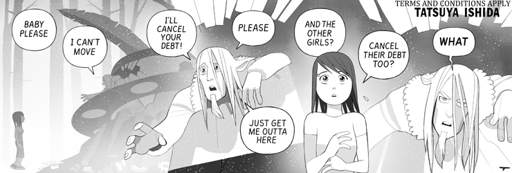
I always feel that Tatsuya's skill in composing the way we see a scene over just a few panels gets too little attention.
I mean... just look at how this strip develops: It almost seems like a camera is circling and zooming in on the pimp. We see an overall shot from the side, then a closer shot from a 3/4th position and eventually the closeup on his face - inter-cut by looking down at Roxanne from his (higher) point of view.
Often compositions of daily strips are plot driven - what plot points do I need to make? How can I get to the punchline? Tatsuya is (at the same time, no less) driven by the visual beauty. And that is where he has us hooked. Because this visual beauty is the bait for us to get the deeper message behind the beauty, in the plot.
And I repeat myself here: The way Tatsuya captures these things in ink and shades make me return every day.
But what I love about today's strip is the way we get so see a look on the pimp's face that so much reminds us of the young, more innocent him - and how quickly it changes to the ugly side that hides behind even today's calm facade.
I can't help it but have to think of Andy Serkis portrayal of Smeagol/Gollum.